10 Color Theory Basics Everyone Should Know
Welcome To Cora’s Corner, where every month I am going to help you with your artwork issues. Gear up for a little Design 101. In this blog, we’ll tackle color theory basics that every design enthusiast should know.
1. How To Use The Color Wheel
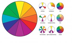
Like trigonometry, the color wheel is probably one of those things that you learned about as a young child and haven’t thought of since. However, to really understand color, you may have to dust off some of that knowledge.Simply put, the color wheel provides a visual representation of which colors blend nicely together.

2. What Are The Basic Colors
Here’s how things break down:
Primary Colors: Red, blue, and yellow. Cannot be made from mixing other colors.
Secondary Colors: Orange, Purple, and Green. Can be made by mixing the primary colors together.
Tertiary Colors: The six shades that can be made from mixing primary and secondary colors.
3. Changing Colors With Neutrals:
Once you’ve selected a basic color, it’s easy to create many different versions within the same family. All you need to do is combine that color with a neutral in order to make it lighter or darker. This is known as tint, shade, and tone.
Tint: The act of lighting a color by adding white to it.
Shade: The act of darkening a color by adding black.
Tone: Slightly darkening a color by adding gray.
Many artists recommend experimenting with color by mixing inks until you have a feel for how drastically neutrals will affect a color. Or look at a Pantone book.
4. Understanding Color Temperature
You may have heard colors described as having a temperature. These temperatures also describe where the color falls on the color wheel. Reds, oranges, and yellows are often described as warm colors. They are typically more vibrant and seem to bring a sense of liveliness and intimacy to a design. In contrast, blues purples, and most greens are the cool colors. They can be used to calm down a design and bring a relaxed feel. When choosing color temperature for a design, you should consider the emotion the design is trying to evoke.
5. Complementary Color Scheme
When it comes to color schemes, complimentary is the simplest. It uses two colors that sit opposite each other on the color wheel. Typically one color acts as the dominant shade and the other as an accent. This means combinations like red and green, blue and orange, or yellow and purple. This color combo is extremely high contrast, which means that it’s best used in small doses and when you want to draw attention to a particular design element.
6. Split-Complementary Color Scheme
If you like the idea of a complimentary color scheme, but are afraid it may be a little too bold for your tastes, split complimentary is a safer choice. To make this color scheme, you would first choose your base shade. Then, instead of choosing the color directly opposite of your base, you chose the two shades on either side of the opposite color. Those two shades will provide a much needed sense of balance to the design. You’ll still get the visual impact of bold color, but you’ll be able to incorporate more of it.
7. Analogous Color Scheme
The analogous color scheme refers to using three colors in a row on the color wheel. Typically, two colors will be either primary colors with the third shade being a mix of the two and a secondary color. For example, you could choose red, orange, and yellow or red, purple, and blue. The key to using this color scheme successfully is proportion. Again, the 60-30-10 Rule comes into play. You’ll want to choose one color to be the dominant shade, one to support the dominant, and the third, most vibrant color as an accent. Interestingly, you can also create a similar color scheme using neutrals. It’s typically referred to as a monochromatic color scheme. Simply choose black, white, and gray in lieu of brighter shades.
8. Triadic Color Scheme
Triadic color schemes, sometimes also referred to as a triad, refers to using three colors with equal space between them on the color wheel. The three primary colors (red, blue, and yellow) are a perfect example, as are the three secondary colors. This type of color arrangement is often extremely bold. Since the colors are in such high contrast and pure hues are often used, you’ll most often see this scheme in children’s designs.
9. Tetradic Color Scheme
After the triadic scheme, things get a little more complicated. We’re moving on to balancing four colors in the design. The tetradic scheme, also sometimes referred to as a rectangle scheme because of the shape it makes on the color wheel, focuses on using two distinct pairs of complimentary colors. In this scheme, color temperature plays a very important role. Try to make sure that you choose two warm colors and two cool colors to fill the design rather than an odd number. Using an even amount of both will help bring balance to the design.
10. Square color scheme
The square color scheme is very similar to rectangular in both number and name. It uses four shades, but instead of focusing on opposing pairs, the colors are evenly spaced throughout the color wheel. No matter which colors you choose, this scheme will be comprised of one primary, one secondary and two tertiary colors. Vary the intensity of the four colors by making two shades more neutral and two a little bolder. Again, similarly to the tetradic scheme, you’ll want to pay attention to achieving an equal number of warm and cool colors. But, rather than giving equal attention to both color pairs, you should pick one shade to dominate the space and use the other three as accents.
Be bold, be brave, but most of all be colorful. Have fun.
Until next month.
Cora Kromer
cora@qdigitizing.com