Considerations to Design and Screen Printing.
Welcome To Cora’s Corner, where every month I am going to help you with
your artwork issues. This month I would like to discuss things to consider while designing and printing your garments.
DESIGNING
Tips that are especially important to keep in mind when designing for t-shirts. Some of them are more or less unique to this type of design and thus easy to overlook.
Let’s get going.
1. Who is your intended audience?
This obviously only applies if you are designing for a client rather than yourself. Yet surprisingly, even experienced designers often confuse the two situations, especially when something like clothing, which depends much on personal taste, is concerned. Think about who the intended wearer is, and what they would go for.
2. Image size.
That is the size of your design, but with more of an emphasis on how that size relates to its surroundings: in this case, a t-shirt to be worn. Your level of detail, or even your shape, might look cool on a computer screen, but weird when reduced (or inflated, as the case may be) to fit the standard screen printing platen. The best thing to do is print out your design periodically and actually hold it up against your own body, to make sure everything looks right.
3. Keep color and detail simple, but not boring.
Especially with screen printing, the more colors you use, the more expense and risk of error you take on at the printer. So it’s best to keep it simple—two to three colors plus halftones is usually a good rule of thumb—but not so much that your design is monochrome and boring.
The same goes for the level of detail you apply. A lot of complexity might look good in a sharp digital format, but spells disaster when translated into ink on fabric. Generally simple, thick lines are the safest in this domain, though you might not want to get too dull or corporate either.
4. Color of T-shirt.
This will impact your entire color scheme. Decide if you will use the shirt color as one of the design colors.
5. Check your design balance
Distribution of visually “weighted” components across a design in a way that does not tip the scales too far in any one direction. It is generally a good idea to maintain such a balanced quality. However, in certain
situations you can get away with an edgy imbalance.
6. Go back to the world before computers
Graphic design compositions made before the aid of computers can be a great source of inspiration that keys your mind to the fundamentals and encourages you to avoid lazy digital short-cuts. This bit of advice applies to basically any form of design, but can be especially useful with t-shirts.
PRINTING
This section will focus on preparing your design for a printer and acquiring the vocabulary needed to coordinate with them.
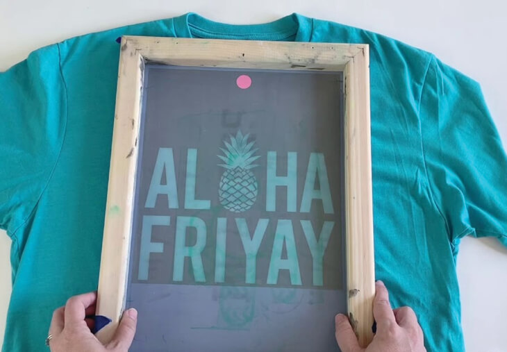
1. Printing processes
There are basically two ways to apply an image to a t-shirt. One of them is digital. This process is capable of transferring an extremely detailed image in all of its complexity—even a photograph. It generally only makes sense for small runs, though, because it more expensive than screen printing.
For larger runs, your best bet is screen printing. In this process, an image is broken down into separations, each of a single color. These are then transferred to screens, inked, and applied to the t-shirt—one after the other, to reproduce the original image. However, the layered process does
introduce certain complexities which I will discuss in the next section.
2. Separations
This refers to the separation of an image into various single-color layers, which are then deposited on a surface in succession to reconstitute the whole. In order to make the separating process as simple as possible, you definitely want to design in a digital program in which shapes can be separated into digital layers. You’ll also want to use a vector program so your shapes and layers can be retained even if you need to change the scale of your design. Use Illustrator, CorelDraw or Photoshop. When it comes to text, always outline your letters rather than leaving them as a font. This is because your printer might not have the same font collection as you. If you do not outline your font and your printer doesn’t have the one you used, this could derail the process—or worse, the printer might just choose
another font for you that you or your client doesn’t want. In general, always keep in mind that the printer’s output hardware/software might be different from the one you used to create your design, resulting in possible incompatibilities if you do not cover your bases.
3. Registration
Screen-printing is not always a perfectly precise process. A common issue is the minor misalignment of colors in the ink application process, which is known as an off registration. There are various techniques that are used to make sure that the layers register properly. The most common is to create a trap. This is when you widen the area of shapes in your lower layers by a slight amount—say, 1 point—in order to bridge any possible gaps that may occur between them and the next layer, assuming the two are supposed to be flush. If you are familiar with bleed, it is a very similar idea. Another way to avoid gaps is to simply print one color directly on top of another. This is called overprinting, and can be useful when dealing with thin lines that can be lost if you were to use trap. Keep in mind, however, that, depending on the type of ink used, overprinting can result in a darker, blended color. This can be bad if that is not what you want, or good if you are purposely trying to introduce a darker element, such as a shadow, without adding an actual
new color. The final approach, called knockout, is simply to not use any trap or overprint, relying on the precision of the printer to align the layers perfectly. Many printers are happy to help you with the above, and will even go into your design file to create the necessary traps and overprint areas. Others may ask you to prepare the files for printing yourself, or else pay a fee.
4. Color
Most print shops will thank you for using Pantone colors. It’s the most popular color matching system.
As a rule of thumb, use Pantone coded colors, known in many design programs as spot colors. However, keep in mind that some more old fashioned print shops might not use Pantone, and may charge a fee for matching your Pantone requests to their own color swatch. In this case, either ask for their swatch in advance to decide on your colors, or be willing to request generic colors like “orange” and let the print shop make the calls.
5. Shirt fabrics and inks.
Finally, it’s important to think about the actual fabric of your t-shirt and the inks you use to print on it. T-shirt designs are often grouped into three size categories: standard designs are less than 14 x 14 inches, so can easily fit into the center of most shirts; oversized designs are bigger than that, covering the majority of the shirt but not crossing onto the sleeves, collar or hem; finally, all-over designs, like their name implies, do cross over to all areas of a shirt. Keep in mind that seams and collars can be ink traps, as well as interruptions of your design. Similarly, sleeves will change the direction of a design depending on the position of the wearer’s arms. So if you’re going to design an all-over shirt, your design should be abstract and not affected by such variables. Ink, like the shirt fabric itself, comes in a staggering number of varieties, so make sure to survey the options that your shirt supplier and printer provides. Some specialty inks include foil (shiny), high density (dimensional, textured appearance), gel (thick and rubbery), and water-based (no feel at all).
Until next month.
Cora Kromer
cora@qdigitizing.com