Combine Colors to Create Colors
We would all like to be able to screen print unlimited colors, however you are limited to the size of the press being used. There are some tricks an artist can use to create colors out of the ones being used. You do have to be able to output halftones to film to take advantage of combining colors to make other colors. By using different percentages of one color over another color(s), an artist can create nice shades, tones and colors to give the artwork a more dynamic look and save screens at the same time.
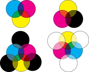
By combining red and yellow, you will get orange. By combining red and blue, you will get purple. And by combining blue and yellow, you will get green. Using different percentages of halftones will give you different shades of these combined colors. You can also add black to the color to darken the shade and white to lighten the shade. You are not limited to just combining two colors. For example, if you add black to red and yellow, you will get brown. Below is an image of examples of color mixing.
As you can see from the example there are many colors, shades and tones you can create as long as your base colors are there. Here is another example of colors separated into halftones and then printed on top of each other. The first part of the image is the combined colors, followed by the separated colors. The customer was printing on black and other medium to dark colors. Therefore a black separation was created too. Look closely and you will see greens, purples and browns. Those were created by combining those 7 colors. Do be afraid to use the shirt color to help you with your design as well.
I would also like to hear from you about your most pressing issues about artwork. Your question may be used in a future issue of this newsletter. If you have questions, please email me at cora.kromer@qdigitizing.com. And please reference this newsletter.
Looking forward to sharing an exciting journey of discovery into the world of Art.
Sincerely,

